By Jeff Bossler
I’m noticing that lots of well-meaning folks are talking past each other regarding the Charter Review Commission’s proposals because it’s difficult for most people to visualize issues of voting power by district and voting models. When I was a freeholder, I was the author of many charts and comparative information organized visually (as opposed to paragraphs of text).
Many people were not able to wrap their minds around the issues were able to get a much better understanding using these tools.
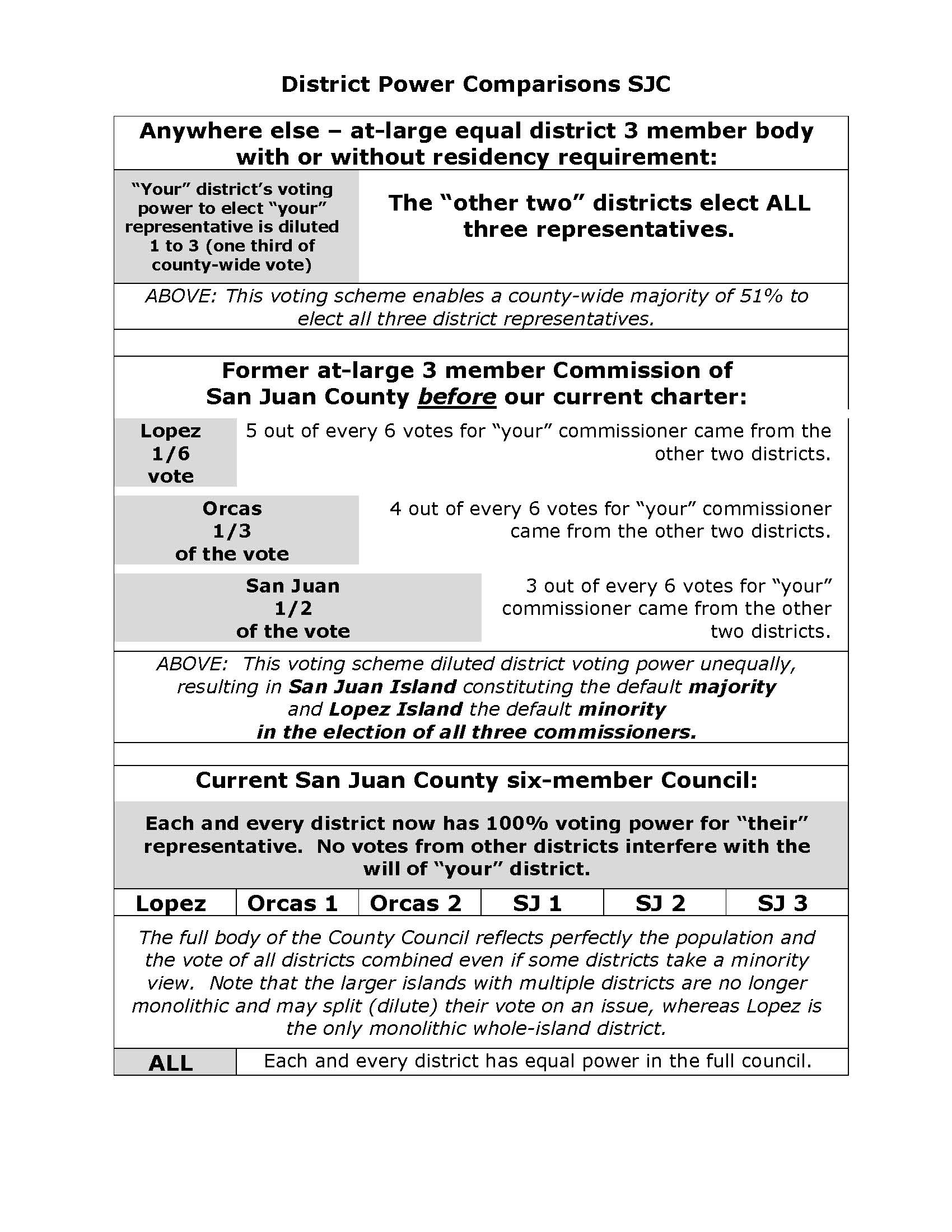
I’ve been working on some new comparative charts and would like to share this one that I’ve attached:

Jeff Bossler’s District Power Comparison chart
**If you are reading theOrcasonian for free, thank your fellow islanders. If you would like to support theOrcasonian CLICK HERE to set your modestly-priced, voluntary subscription. Otherwise, no worries; we’re happy to share with you.**


I appreciate this visual chart, Jeff. Seems that it’s population-driven no matter how you slice the pie and that Lopez is the minority no matter what, with either system. That is unfortunate. I think each island should be counted as just that – an island – irregardless of population. that would mean Lopez would have equal voice to San Juan and Orcas. Not sure where Shaw would fit in – with another island as before I guess. This would be the fairest system of them all but not sure if it would be allowable under the GMA. I also think that unincorporated or not, Eastsound should have a voice just for Eastsound, just as Friday Harbor does. Eastsound has been thrown under the bus by 3 and by 6 commissioners/councilors. That is why I am unconvinced that either of these scenarios will work to level the playing field and since that’s how I feel, why not go back to 3.
i would like you to break down the table with 6 council persons on how much percentage of the vote each district gets, for comparison to the 3 commissioner model breakdown. that would tell a more complete story.
still, under the 6 person council, a deer harbor resident and an olga resident made all the decisions for Eastsound. that didn’t work for us Eastsounders! Nor did it with 3! so what’s the answer? what haven’t we thought of yet because neither of these two solutions is workable.
To me the basic issue is whether, as a voter, you want a say in selecting each of the folks who will represent you or only a say in one of six.
In day to day operations of the current 6-member Council the 1 in 6 Council member has very little say in the direction the Council and the County takes. As voters, I think we are very much under represented with the present system. I hope voters will see the wisdom of the model with 3 elected officials that most of the other counties in the State uses proposed by the Charter Review Committee.
John Evans
I don’t think there is a perfect system but at least we could give the one we have now a chance to work. The Charter didn’t start on full implementation until 2010 when the last former BOCC member left. The hostility toward the 6-member legislative body was expressed by the BOCC long before they were invited to the CRC meetings to repeat it. More to the point here, I think Jeff’s math makes a good case for the power of our individual votes being stronger under the 6-person council than the 3. All the outrage against the old system certainly bubbled to the surface in the election. I can’t see getting back on that merry-go-round. Sadie makes good points but how far do we take the one vote per island? Shaw, Waldron,etc. etc. Should geography prevail over population so every island in San Juan County gets one vote?
Thanks for the graphic representation, Jeff. Striving for proportional representation is well founded in U. S. and state electoral practices.
Sorry, John, but SJC is not like most counties in Washington. Thus, doing what “most other counties in the State” do is poor justification for a 3 member council.
Sadie, should Eastsounder’s feel slighted, there is always the alternative of incorporation. This may not be a good solution as incorporation brings another set of issues, but it is a recourse.
Finally, I find myself agreeing with Janice once again. Regretably, there is no structure that is equally representative, only those that are more representative and functionally workable.
Thus, I support the current six member council structure, while wishing that it was a tie-breaking five member body instead. We just cannot have it all, given the complexity imposed by being a county of islands.